Tag: Forms

  • Angular Masked Phone Number Input

    Many of ours apps at some point will require a form with user input. More often than not, a phone number input is required. Rather than simply have the digits, it can be helpful to format the number as its typed in. It’s much more visibly appealing and easier to find a mistake if there is one.

    To do this in a form will require a few steps. We will need a form input for the number. We will need a directive to listen for input changes. Finally, we will need a pipe to tap into the phone formatting itself.

    First things first is creating the telephone format pipe. To do this, we’ll need to import the libphonenumber-js package by Nikolay Kuchumov. The pipe will take a number or phone input and use the the United States phone formatting:

    // phone.pipe.ts
    import { Pipe, PipeTransform } from "@angular/core";
    import { AsYouType } from "libphonenumber-js";
    
    @Pipe({
      name: "phone",
    })
    export class PhonePipe implements PipeTransform {
      transform(phoneValue: number | string): string {
        let ayt = new AsYouType("US");
        try {
          ayt.input(phoneValue + "");
          return ayt.getNumber().formatNational();
        } catch (error) {
          console.log(error);
          return phoneValue;
        }
      }
    }

    We can see here that regardless of input type we’ll return a string. The inputted value will be me made into a string (if it’s not already) and used to create an AsYouType object. Then, we’ll return the value as the national phone number format. If there is an error along the way, the original phone number value will be returned instead.

    Next, we’ll set up the directive to use this phone number pipe. We will listen to a couple different changes to the input: model change event and the backspace event. On each of those events, the input value will be sent through the pipe for formatting. This will look as follows:

    // phone-mask.directive.ts
    import { Directive, HostListener } from "@angular/core";
    import { NgControl } from "@angular/forms";
    import { PhonePipe } from "../pipes/phone.pipe";
    
    @Directive({
      selector: "[phoneMask]",
    })
    export class PhoneMaskDirective {
      constructor(public ngControl: NgControl, private phonePipe: PhonePipe) {}
    
      @HostListener("ngModelChange", ["$event"])
      onModelChange(event) {
        this.ngControl.valueAccessor.writeValue(
          this.phonePipe.transform(event)
        );
      }
    
      @HostListener("keydown.backspace", ["$event"])
      keydownBackspace(event) {
        this.ngControl.valueAccessor.writeValue(
          this.phonePipe.transform(event.target.value)
        );
      }
    }

    Now we’ll create our form with a telephone input. But first, we’ll need to allow the page in which that form resides to use the directive and the pipe. So, we’ll create a module out of the directive, then import that module to the page’s module, as well as add the phone pipe as a provider for the form’s page. We’ll also need the ReactiveFormsModule too for later use.

    // phone-mask.directive.ts
    ...
    export class PhoneMaskDirective {
      ...
    }
    
    @NgModule({
      declarations: [PhoneMaskDirective],
      exports: [PhoneMaskDirective],
    })
    export class PhoneMaskDirectiveModule {}
    // home.module.ts
    ...
    import { PhonePipe } from "../phone.pipe";
    import { PhoneMaskDirectiveModule } from "../phone-mask.directive";
    
    @NgModule({
      imports: [
        CommonModule,
        FormsModule,
        ReactiveFormsModule,
        IonicModule,
        HomePageRoutingModule,
        PhoneMaskDirectiveModule,
      ],
      declarations: [HomePage],
      providers: [PhonePipe],
    })
    export class HomePageModule {}

    With those tools usable, we’ll create the input on the page and add the directive to mask the inputted value:

    // home.page.html
    ...
    <ion-content [fullscreen]="true">
      <form [formGroup]="form" (ngSubmit)="submit()">
        <ion-input
          type="tel"
          formControlName="phone"
          placeholder="Phone Number"
          clearInput="true"
          autofocus="true"
          inputmode="tel"
          phoneMask
          (keyup.enter)="submit()"
        >
        </ion-input>
      </form>
    </ion-content>

    This input is inside of a form. The form here is mainly just to show you how to get the digits back on submit. The type of the ion-input is set to “tel”, as well as the input mode. I’ve done this so when on a mobile device the only tappable buttons should be numbers. There is a keyup.enter event so we can hit the submit fuction on enter button. Also, of course, we have the directive.

    The typescript side of this will look as follows:

    // home.page.ts
    import { Component } from "@angular/core";
    import { FormBuilder, FormGroup } from "@angular/forms";
    
    @Component({
      selector: "app-home",
      templateUrl: "home.page.html",
      styleUrls: ["home.page.scss"],
    })
    export class HomePage {
      public form: FormGroup;
    
      constructor(private formBuilder: FormBuilder) {
        this.form = this.formBuilder.group({
          phone: [""],
        });
      }
    
      public submit() {
        console.log(`Phone: ${this.digitsOnly(this.f.phone.value)}`);
      }
    
      get f() {
        return this.form.controls;
      }
    
      private digitsOnly(str: string) {
        return str.replace(/\D/g, "");
      }
    }

    The above code shows how to set up the form using FormGroup and FormBuilder. Then have helper functions to get to the form controls, as well as get the digits form the masked phone string. All of this considered, we get the following result:

    To get a full copy of the code, you can visit the repository here.

  • Login Form with Show/Hide Password Switch

    For me, I always appreciate when login forms give you an option to show the password I’ve typed in. It may seem commonplace, but all too often sites neglect to add this feature. It’s nothing more than a slight nuisance, but I appreciate being able to hit the toggle, show what I’ve typed so I don’t feel like I need to re-type everything if I think I’ve messed up. So, whenever I create an email/password login for my work projects, I make sure to include this feature.

    This is a very simple addition to a basic login form. First we setup our project, create a login page, and change the routing to go to this login page first. Of course, in a different terminal tab, we’ll serve the app to view realtime changes:

    $ ionic start ionic-login-hide-show blank --type=ionic-angular
    $ cd ionic-login-hide-show
    $ ionic g page login
    
    $ ionic serve

    Changing the first page to be the newly created login page requires modifying the app-routing.module.ts file as follows:

    // app-routing.module.ts
    ...
    const routes: Routes = [
      {
        path: "home",
        loadChildren: () =>
          import("./home/home.module").then((m) => m.HomePageModule),
      },
      {
        path: "login",
        loadChildren: () =>
          import("./login/login.module").then((m) => m.LoginPageModule),
      },
      {
        path: "",
        redirectTo: "login",
        pathMatch: "full",
      },
    ];
    ...

    After opening the newly created login.page.ts file, we’ll start to build out the form logic. This will include elements of the ReactiveFormsModule, so that will need to be imported to the login.module.ts file. We’ll build out a FormGroup with email and password fields, with some Validators to ensure users enter the correct information:

    // login.module.ts
    ...
    import { FormsModule, ReactiveFormsModule } from "@angular/forms";
    ...
    @NgModule({
      imports: [
        CommonModule,
        FormsModule,
        ReactiveFormsModule,
        IonicModule,
        LoginPageRoutingModule,
      ],
      declarations: [LoginPage],
    })
    export class LoginPageModule {}
    
    // login.page.ts
    import { Component, OnInit } from "@angular/core";
    import { FormBuilder, FormGroup, Validators } from "@angular/forms";
    ...
    export class LoginPage implements OnInit {
      loginForm: FormGroup;
    
      constructor(private formBuilder: FormBuilder) {
        this.loginForm = this.formBuilder.group({
          email: ["", Validators.compose([Validators.required, Validators.email])],
          password: ["", Validators.required],
        });
      }
    ...
    }

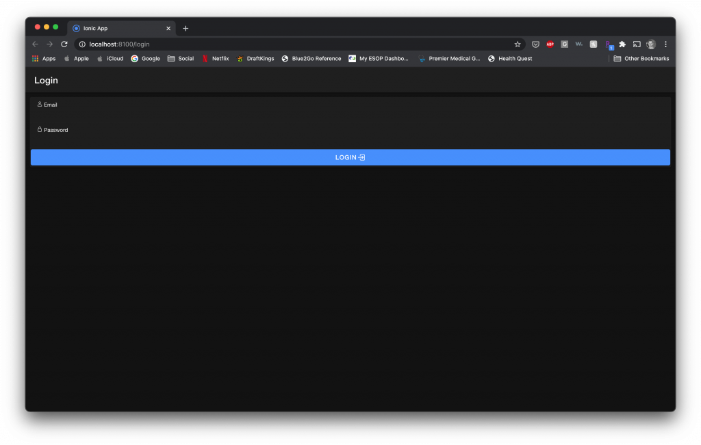
    Now that we have some form logic built out, we can place some HTML in place to get those inputs ready for the user to enter their email and password. Further, we’ll add a button for them to click to initiate the login process:

    <ion-header>
      <ion-toolbar>
        <ion-title>Login</ion-title>
      </ion-toolbar>
    </ion-header>
    
    <ion-content>
      <ion-card>
        <form [formGroup]="loginForm">
          <ion-item>
            <ion-label position="stacked">
              <ion-icon name="person-outline"></ion-icon>
              Email
            </ion-label>
            <ion-input type="email" formControlName="email">
            </ion-input>
          </ion-item>
          <ion-item >
            <ion-label position="stacked">
              <ion-icon name="lock-closed-outline"></ion-icon>
              Password
            </ion-label>
            <ion-input type="password" formControlName="password">
            </ion-input>
          </ion-item>
          <ion-button expand="block" type="submit">
            Login
            <ion-icon name="log-in-outline"></ion-icon>
          </ion-button>
        </form>
      </ion-card>
    </ion-content>

    Now that we have all of that taken care of, we can get to the important part, which is the icon to show and hide the password. Inside of the password item, we’ll add an icon, which has an on click action of toggling the password’s visibility. This function entails toggling a boolean for showing the password or not. Further, it will control which icon is shown. However, that won’t get the job done. We’ll also need to add some logic in the HTML to change what type of input the password field is. The type will be determined by the aforementioned boolean. Without this piece, we wouldn’t be able to actually visibly see the password at all. The other pieces are nice and all, but changing the input type is what really matters.

    // login.page.html
    ...
    <ion-item >
      <ion-label position="stacked">
        <ion-icon name="lock-closed-outline"></ion-icon>
        Password
      </ion-label>
      <ion-input
        [type]="showPwd ? 'text' : 'password'"
        formControlName="password"
      >
      </ion-input>
      <ion-icon
        slot="end"
        [name]="pwdIcon"
        (click)="togglePwd()"
      >
      </ion-icon>
    </ion-item>
    ...
    // login.page.ts
    ...
    export class LoginPage implements OnInit {
      loginForm: FormGroup;
      pwdIcon = "eye-outline";
      showPwd = false;
    ...
      togglePwd() {
        this.showPwd = !this.showPwd;
        this.pwdIcon = this.showPwd ? "eye-off-outline" : "eye-outline";
      }
    }

    So, with that, we can see that the password field type changes from 'text' to 'password' depending on the boolean value. The icon changes along with it to show you which type you’d be changing the field too. One thing to note is the the showPwd field should start as false. This way, the user gets what you’d expect first… the password is hidden. All together, it looks like this:

    Some notes

    There are certainly some improvements that could be made to this form, such as:

    • Showing text below the form fields indicating any errors.
    • Disabling the Login button unless the form is valid.
    • Not showing the show/hide button until a password has been typed.

    Let me know if that is something you’d like me to add in a part two!

    To get a copy of the full code example, check out the Github repo here.